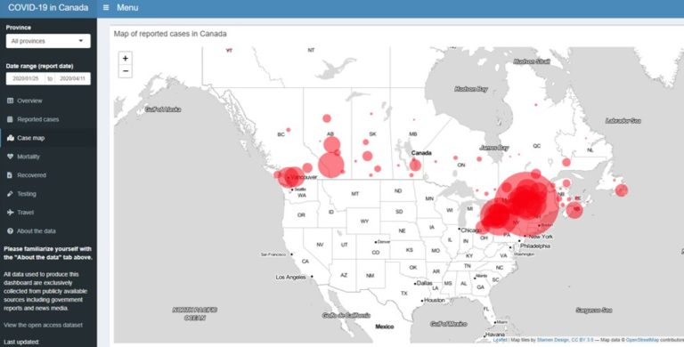
Emily Acheson
Canada

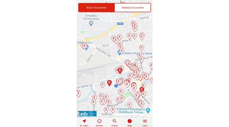
Balca AĞaÇsapan
Turkey
Antonio Annis
Italy
Rosa
Coluzzi
Coluzzi
Italy
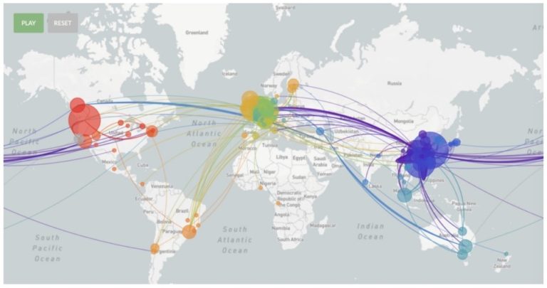
Nael Al Hassanieh
Lebanon
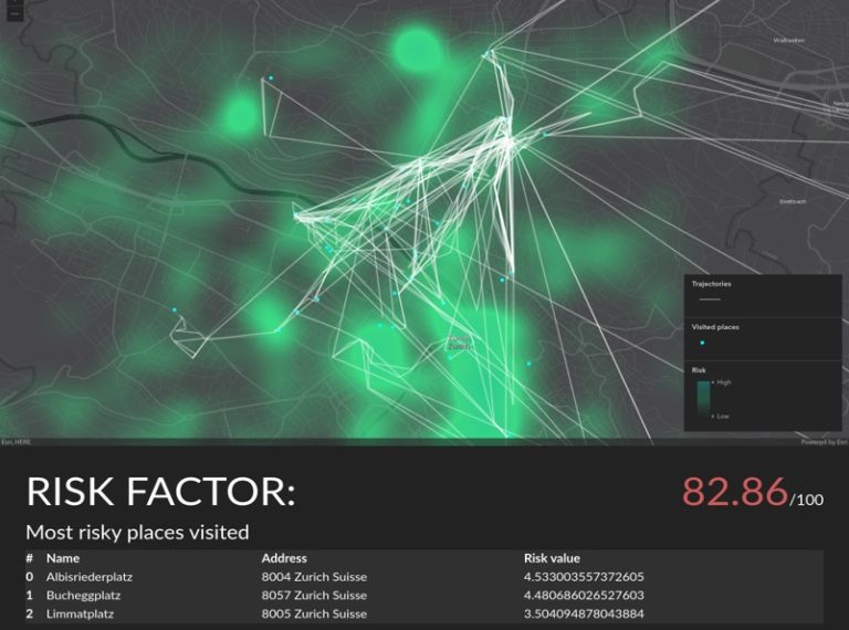
Simon Haumann
Switzerland
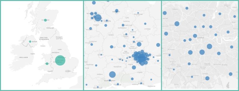
Damien Mansell
The United Kingdom
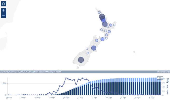
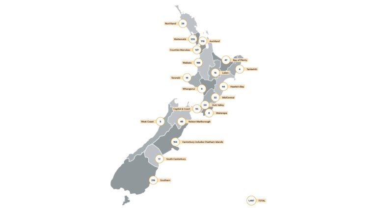
Leigh McKenzie
New Zealand
Alan
Pearse
Pearse
Australia
Maud Soetens
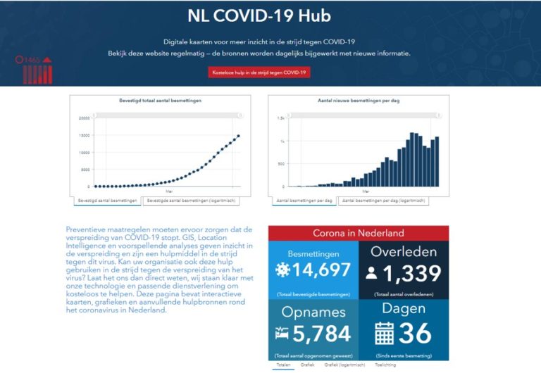
The Netherlands
Lisa
StÄhli
StÄhli
Switzerland
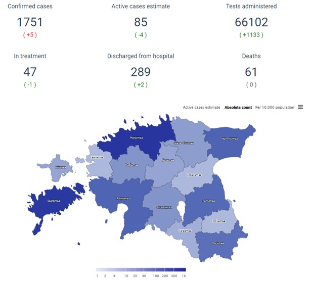
Sander Varbla
Estonia
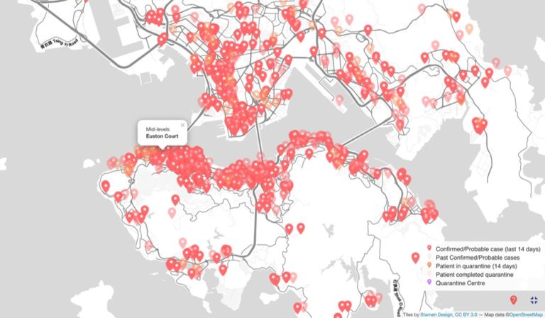
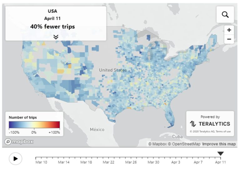
Kenneth Wong
Hong Kong